Who: Habit, Personalized Nutrition. An at-home test kit giving you insight into what your body needs along with a meal plan for how to eat for the one and only you.
What: Brand Refresh, Website Update, Product Design, Marketing Materials, Design Language System
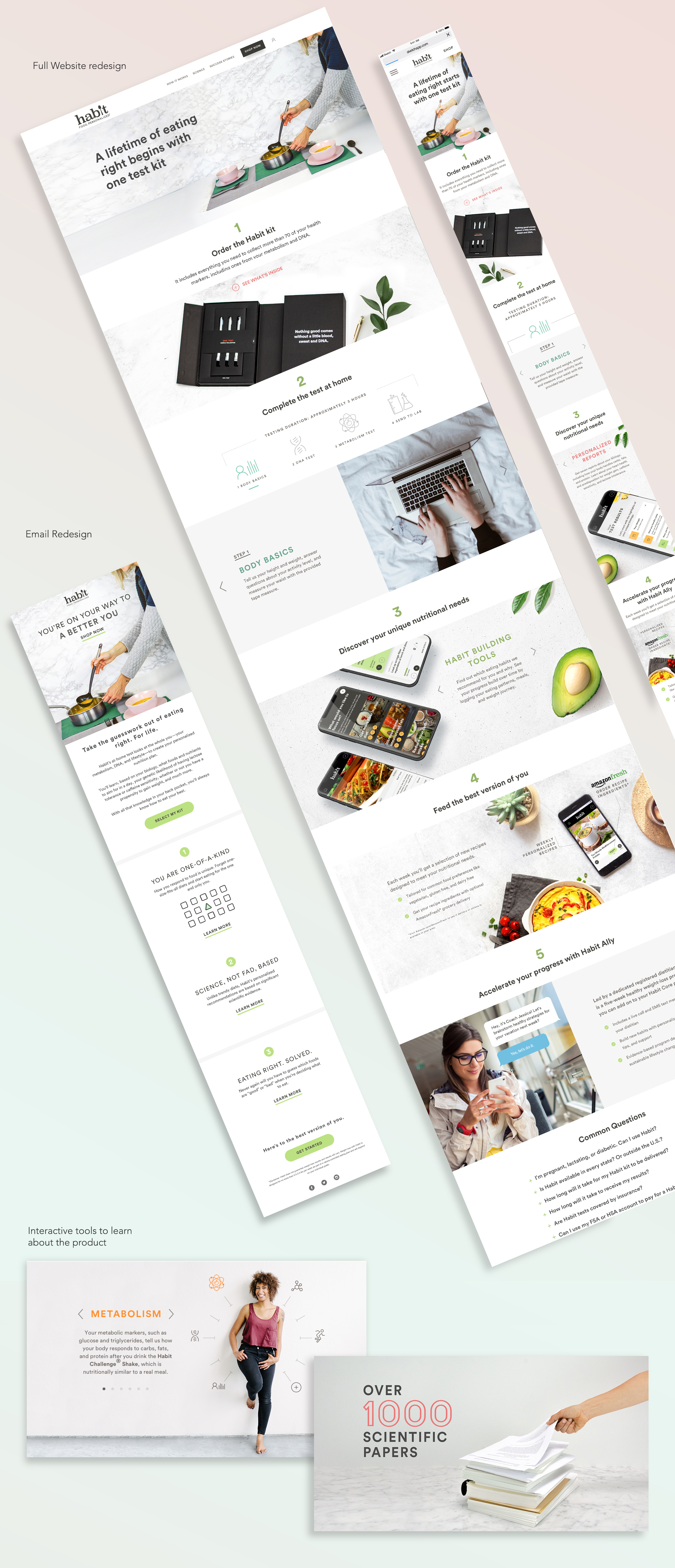
Why: Habit’s brand was cool, but after speaking to users and learning more about who the target audience was in practice, it became clear it was not speaking to them. We needed a brand refresh and messaging update in order to connect with our audience. It also became apparent that our messaging and content confused consumers and they often didn’t fully understand what they would get when purchasing our kits.
Our consumer base was leaning heavily female, and at least 10 years older than the original target audience.
In order to align our new Brand Strategy, we had to update all of our existing Brand assets and rules. We needed to make sure the messaging and imagery supported a clear, concise message that allowed customers to find the information they needed quickly and efficiently.
Results: Along with a holiday push in marketing, our site and experience created the highest sales day in company history over Black Friday (~3k kits / $600k over one weekend). Customer interviews showed that the new brand felt more relatable, our content was more understandable and we earned audience trust.
Lighten up
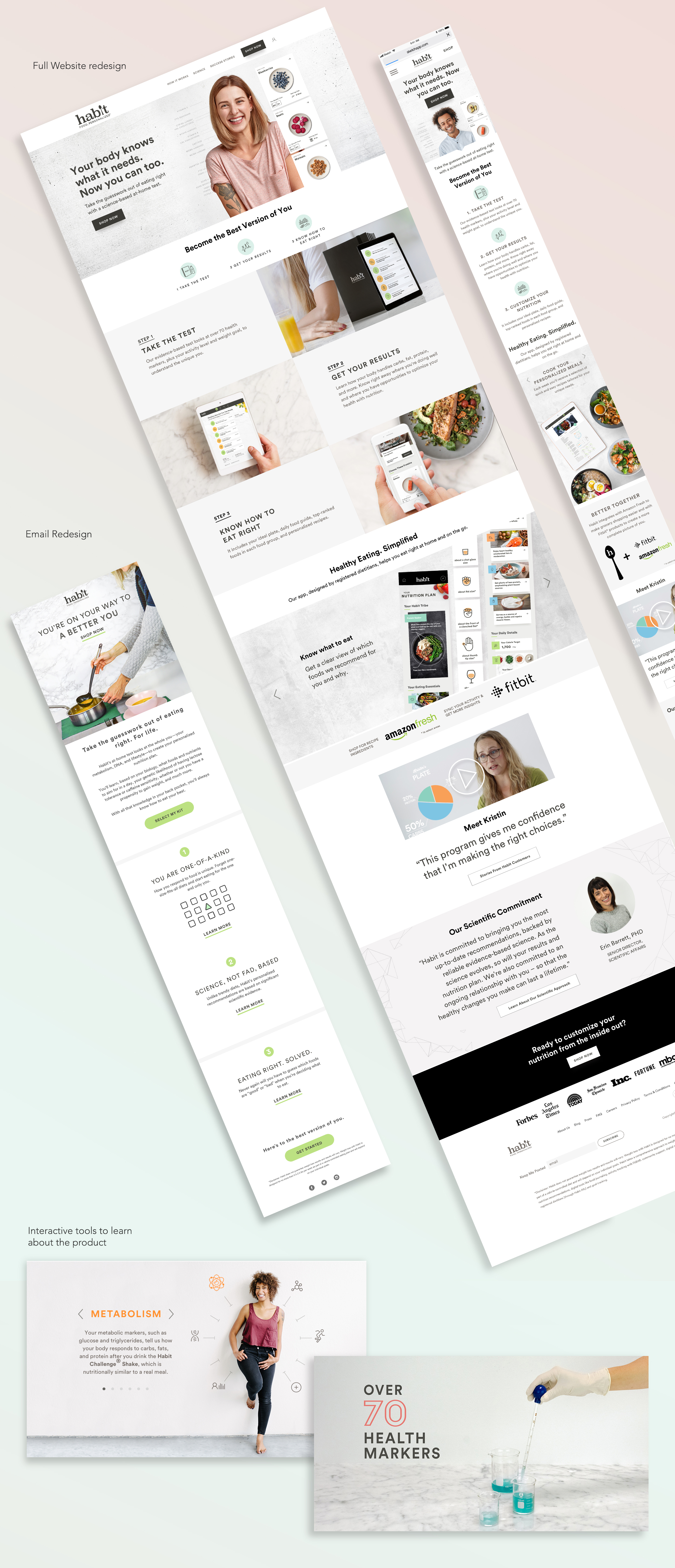
We cleaned up icons across marketing and product, used a smaller, more consistent color palette that would compliment the brighter look & feel.
We moved toward lighter, more open feeling imagery and cleaner and tweaked our typography while still maintaining the edgy, adventurous brand personality.
Go Bold
Secondly, the imagery throughout the existing Habit site was small. We pushed to make imagery larger and more accessible. We simplified the messaging for a scanable experience.
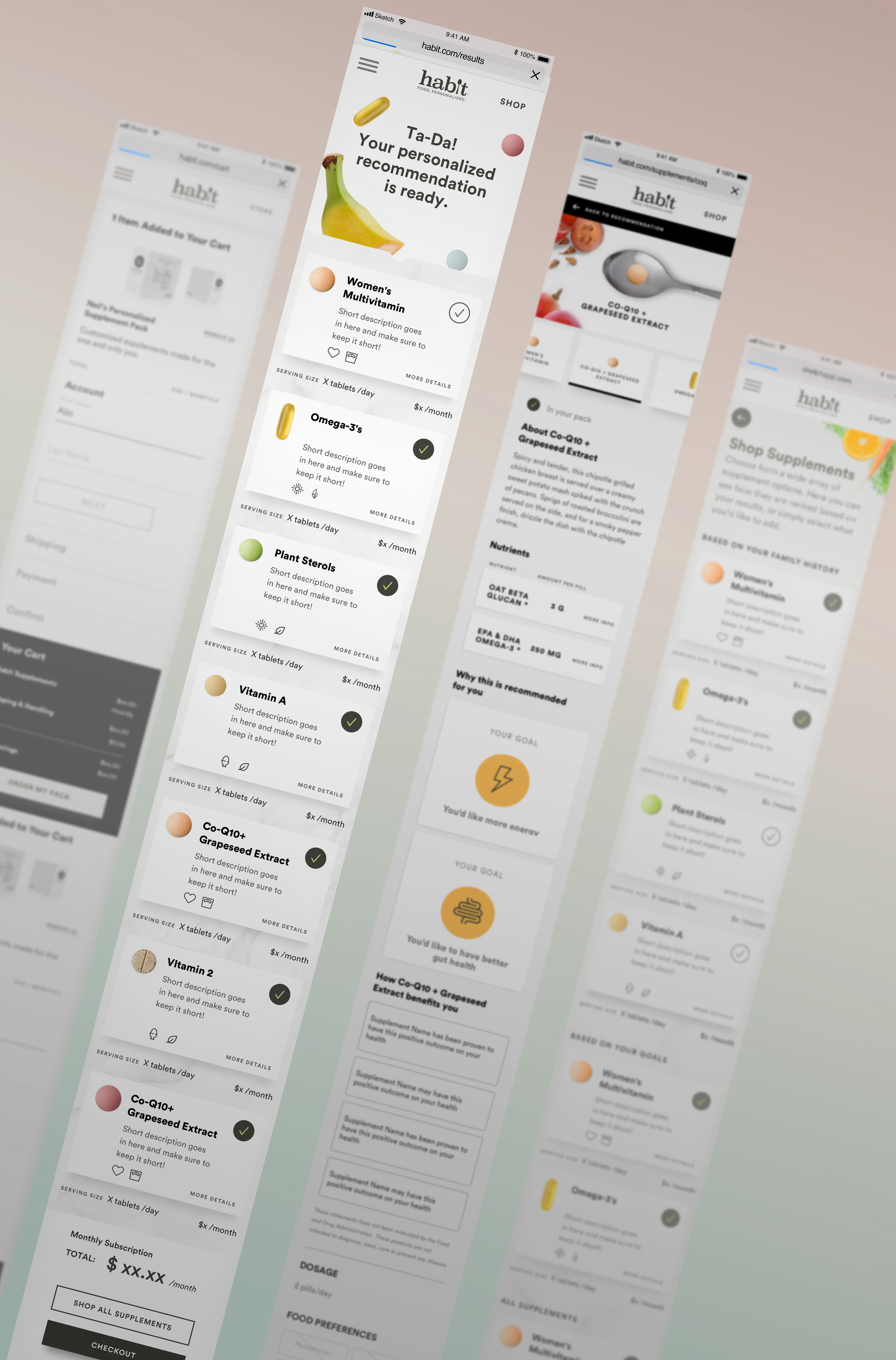
Supplements Product Design
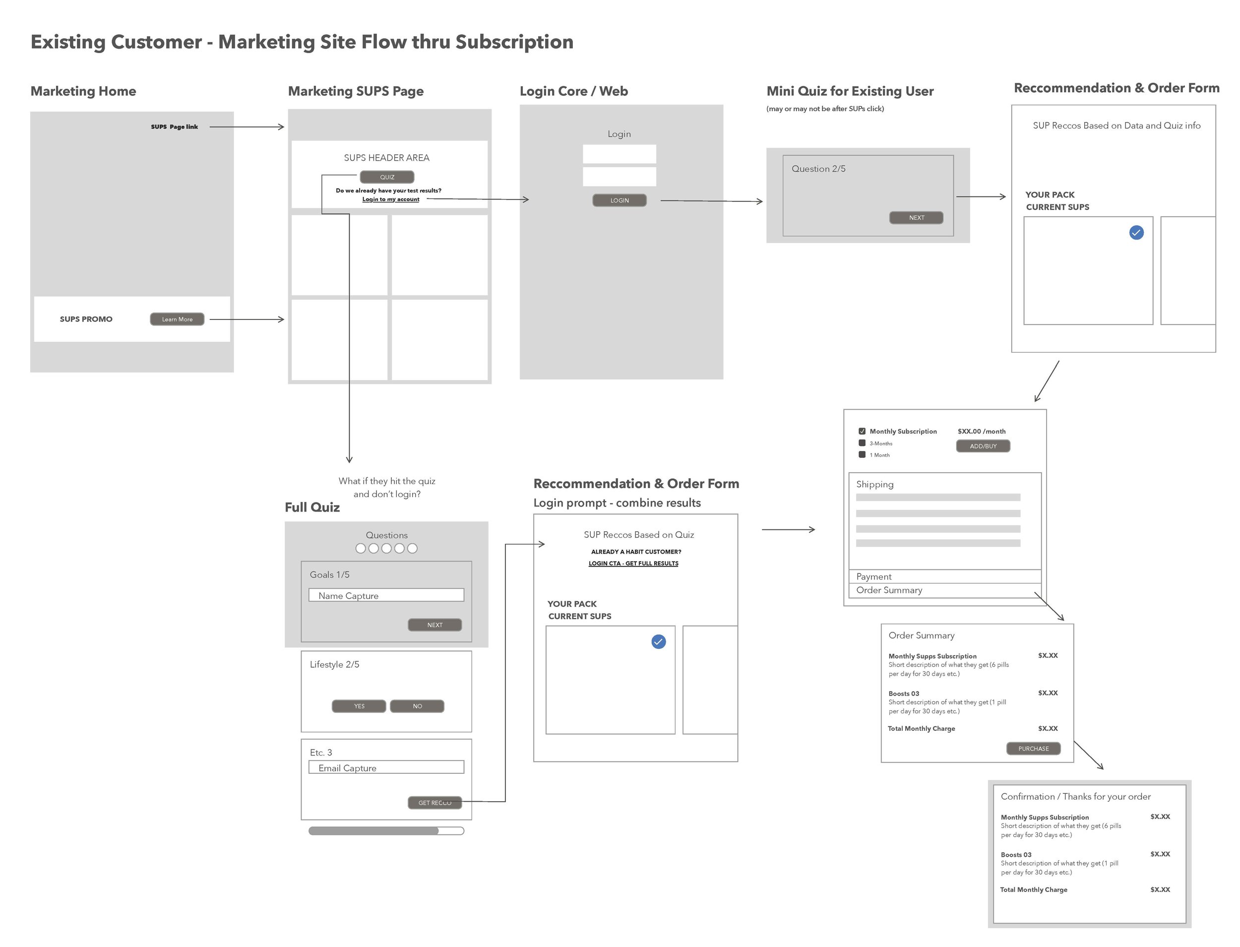
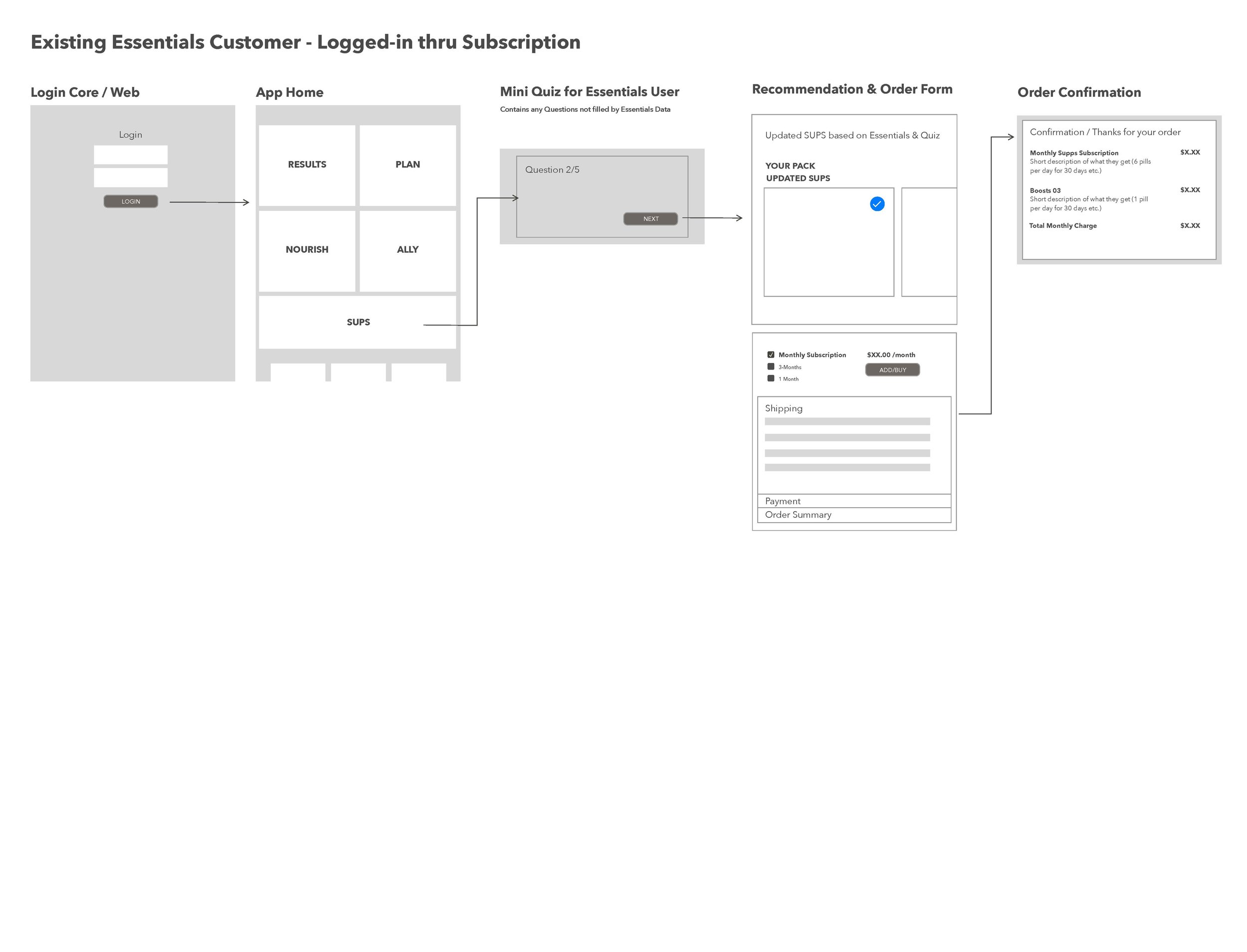
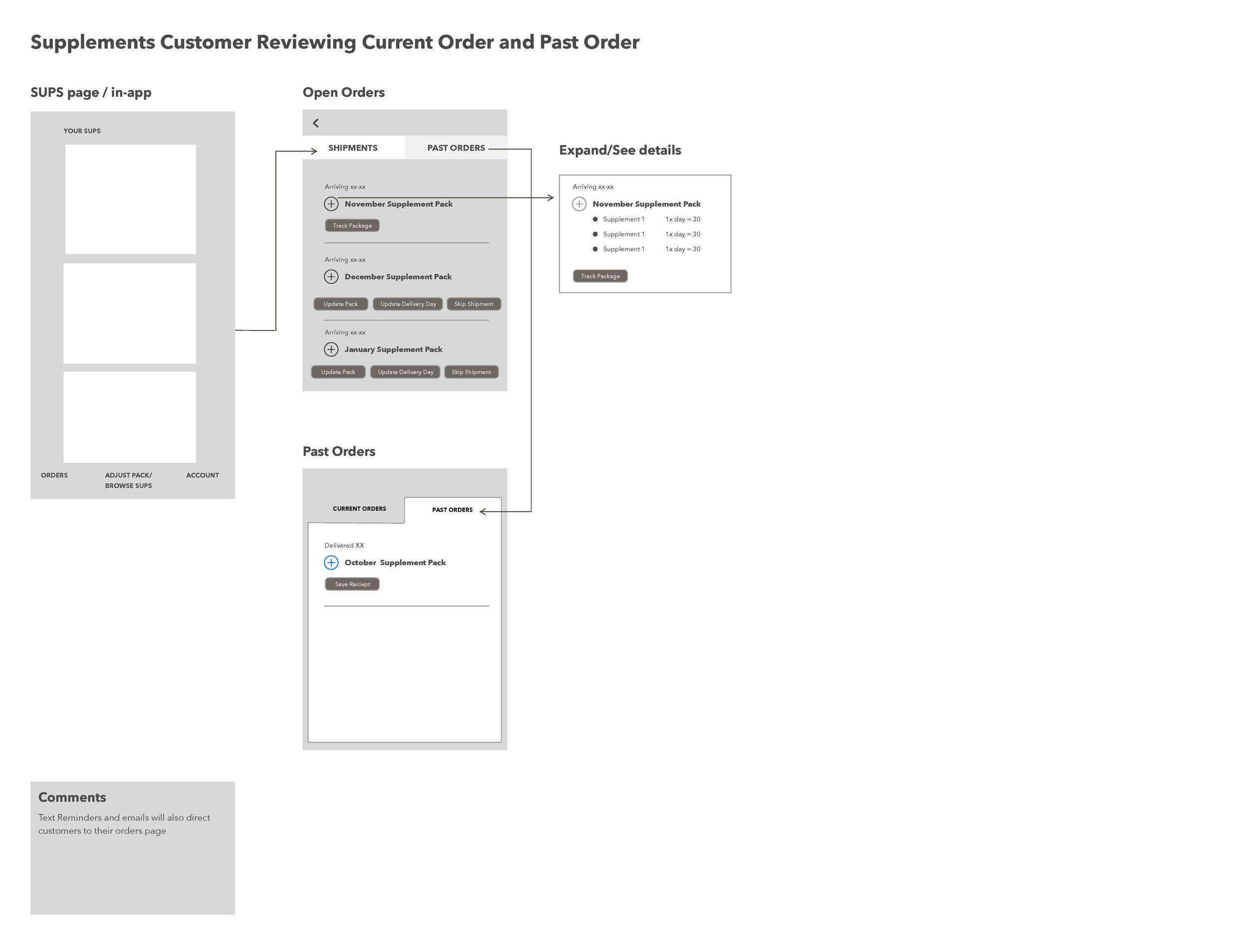
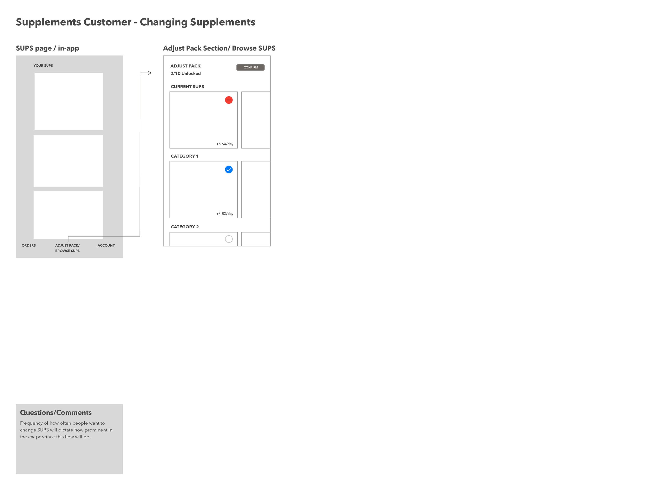
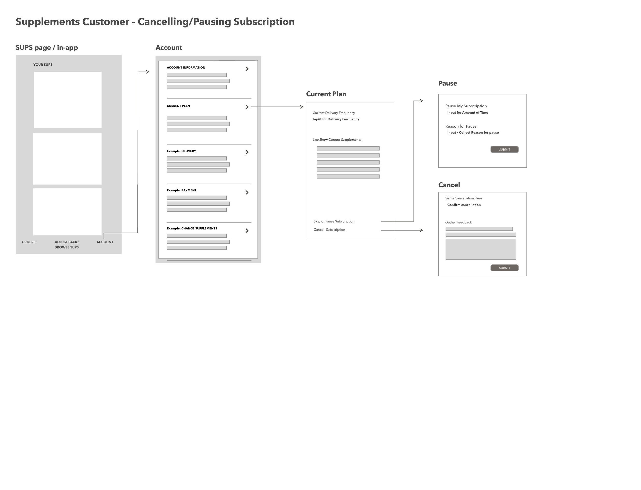
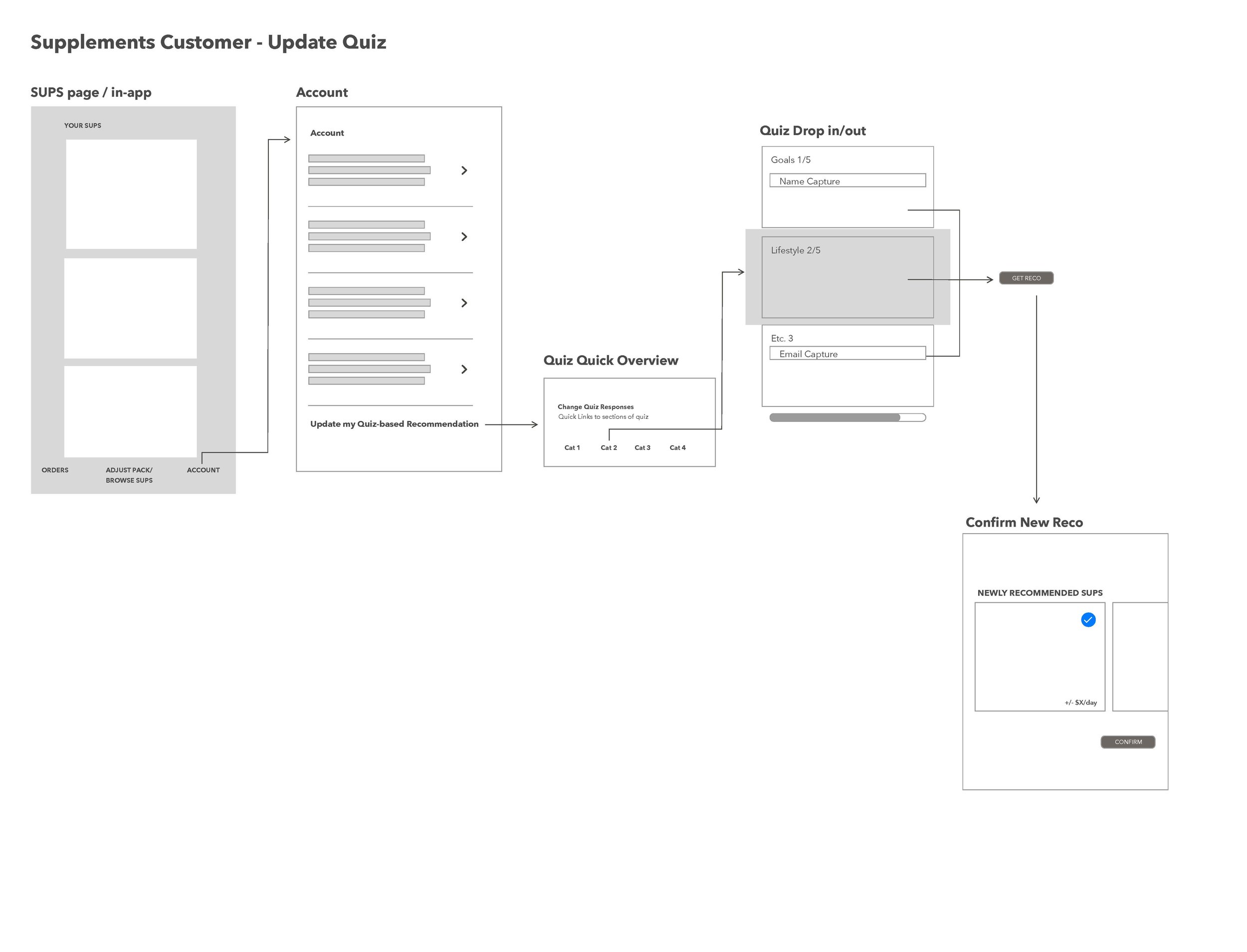
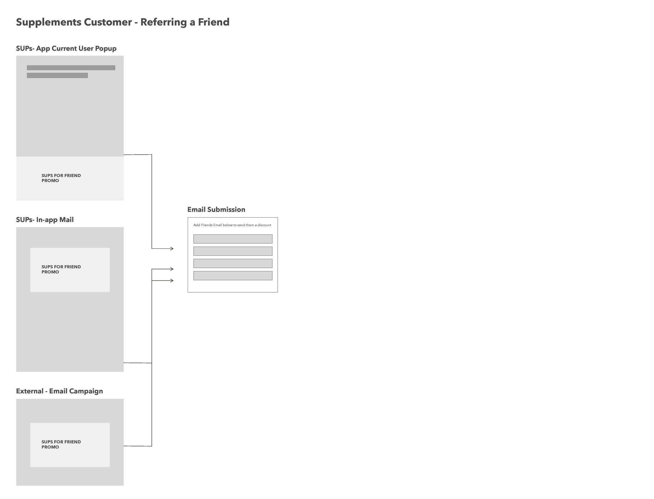
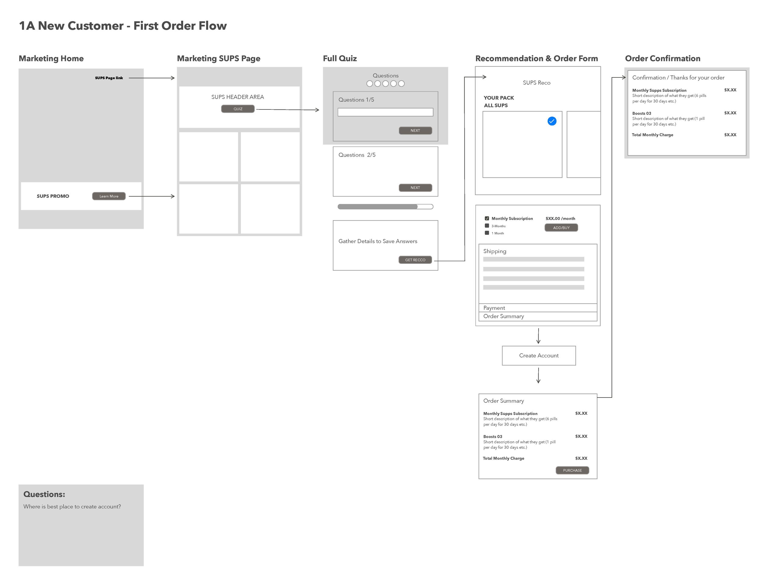
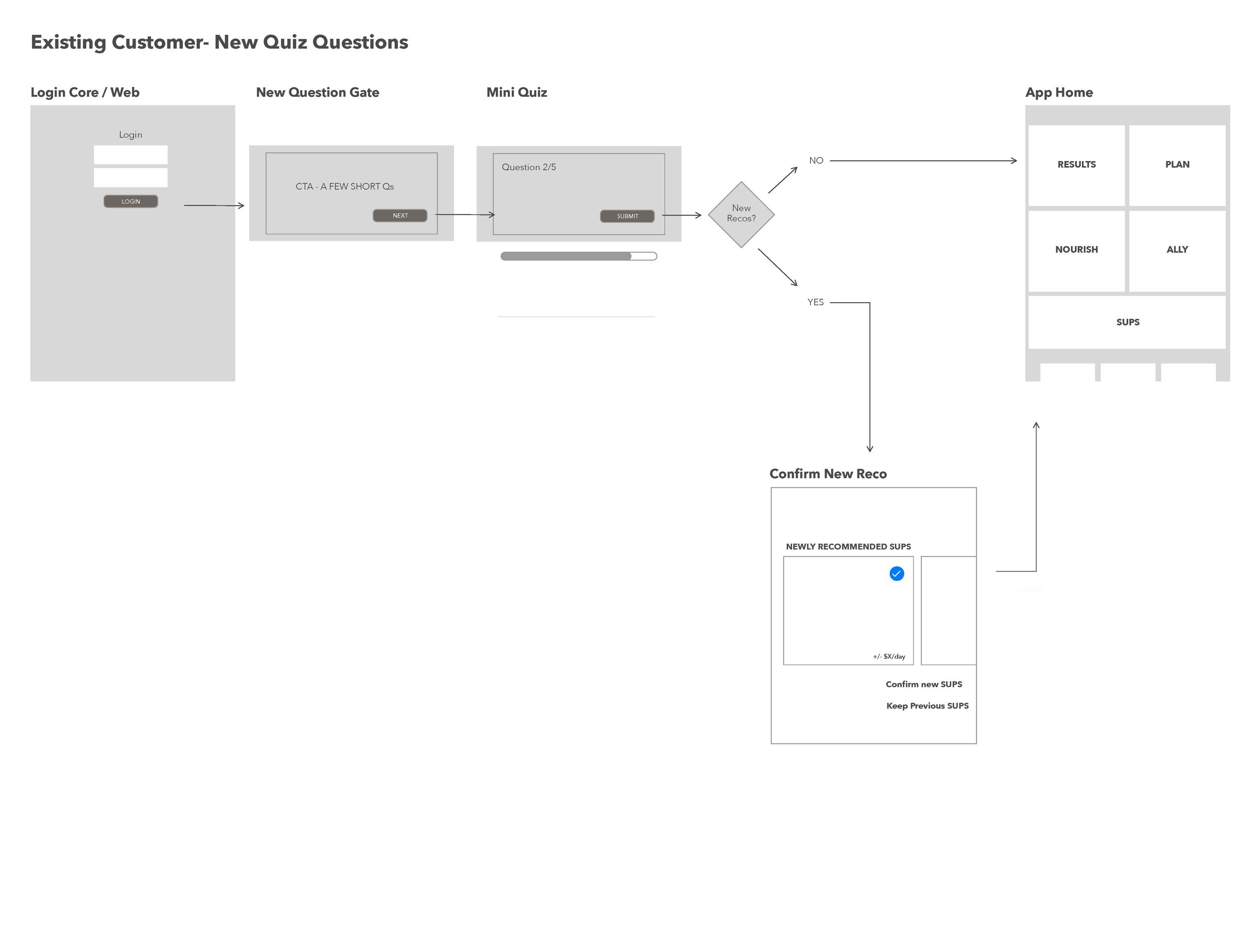
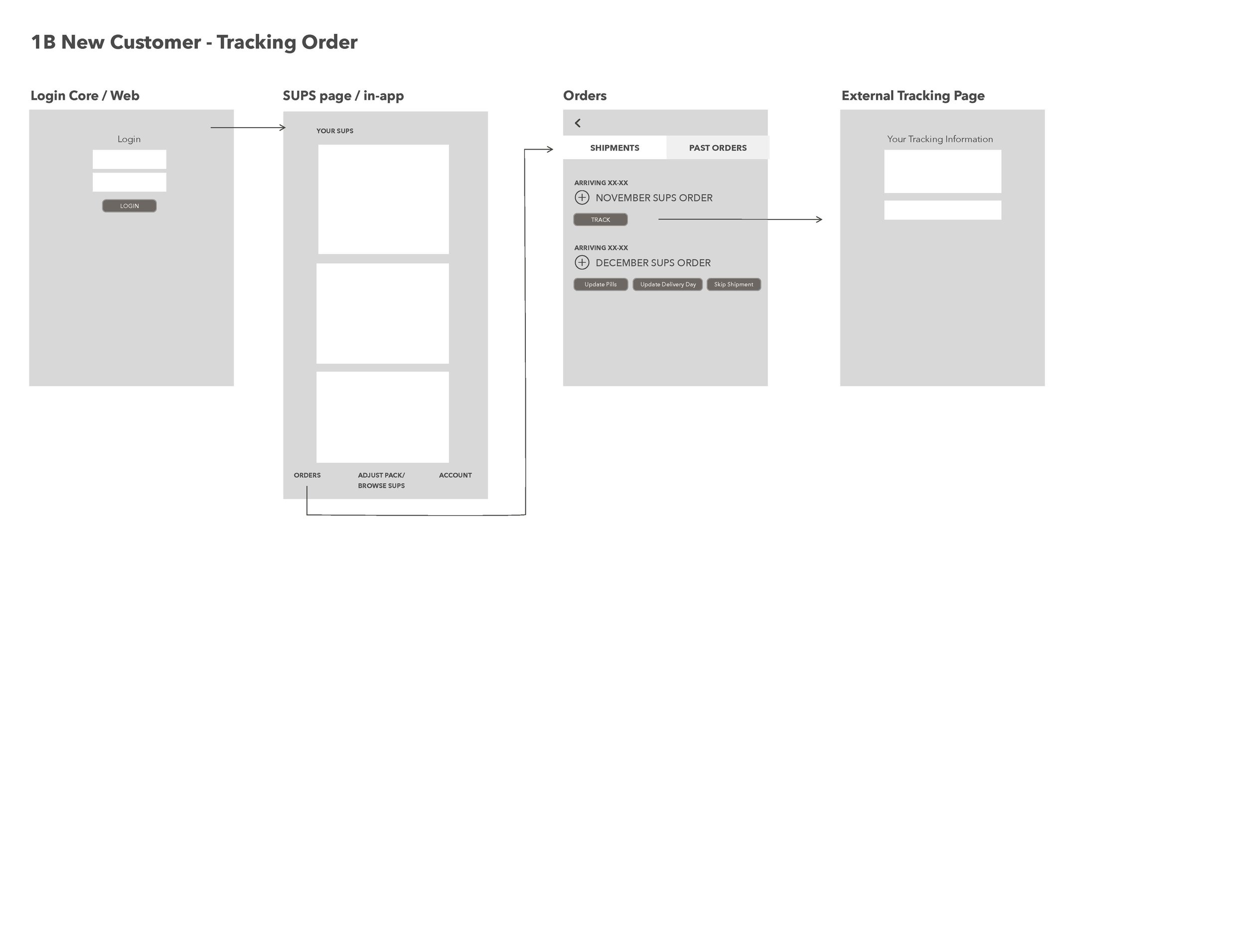
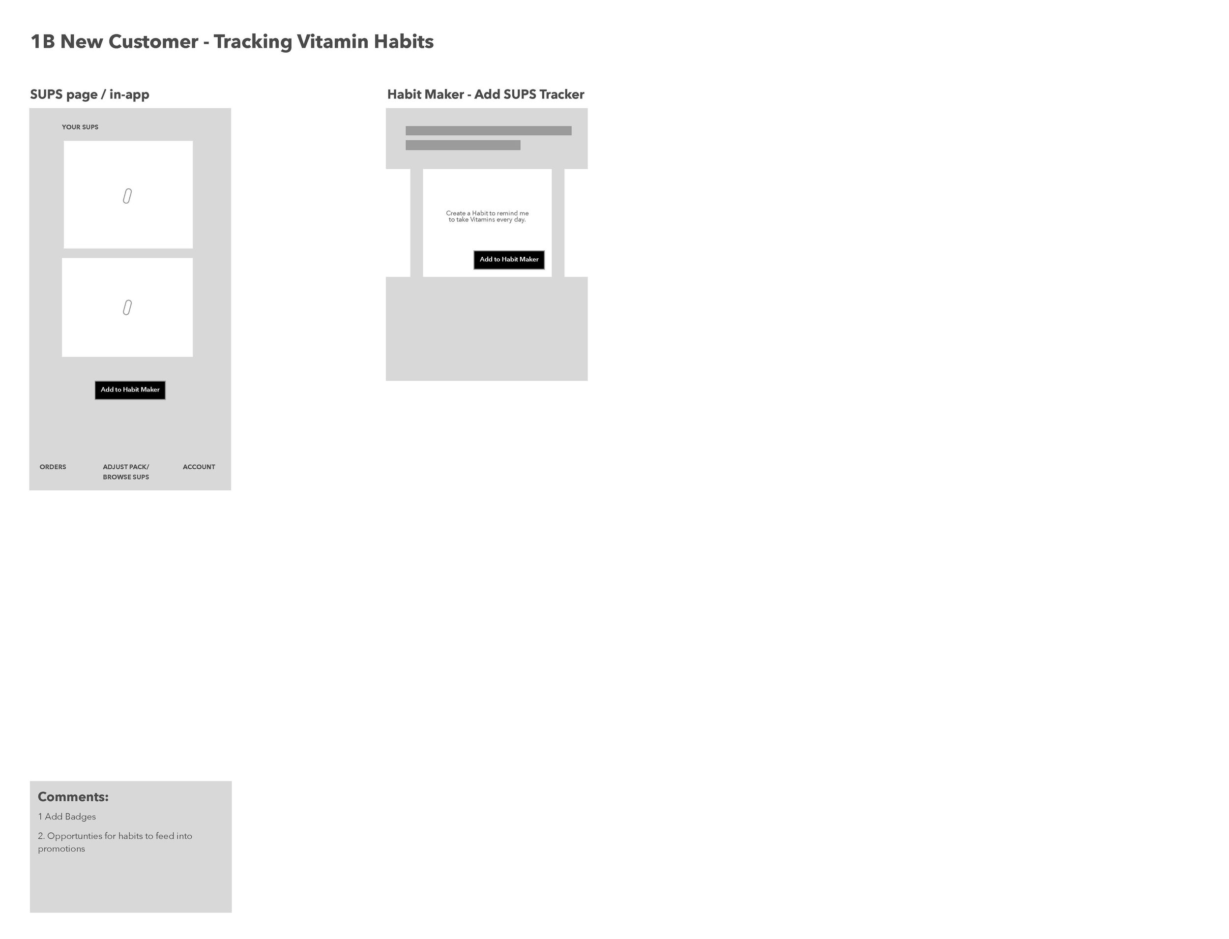
For our newest product debut, Habit wanted to take the user data from our Habit test kits and sync it up with the right vitamin supplement recommendation. Starting with our existing app, we had to create a seamless experience for the user to then logically and easily find, sign-up and
From userflow to development
See below for some of the wireframes from stage 1. By thinking through all the use cases we were able to create an experience that the users could easily follow.
